A Search Card with a Real Glass Effect, Rendered Without a Web Engine
Have you ever clicked Find, only to feel the top of the screen become two rows heavier? That was the case with our Find card, so after opening three other editors, we reduced it to a single row.
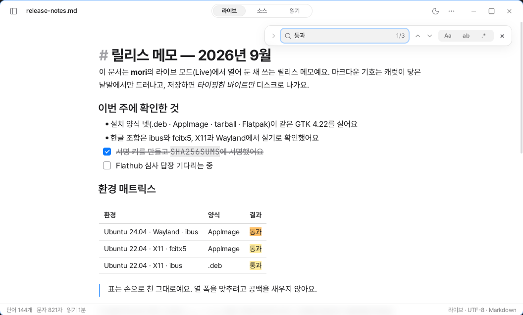
Find is a frequently used feature in an editor. But because it worked well, we left it untouched for a long time.
mori’s Find window was like that too. It was always two rows tall, and even when you opened it after selecting a word in the document, the search field was empty.
Three apps were giving the same answer
Before making changes, we opened Find and Replace on the same document in Typora, MarkText, and Obsidian and captured screenshots. We checked Notion through its published help documentation. Once we put everything into a table, the commonalities were clear.
Find started as a single row. Replace expanded only when needed. A selected word went directly into the search field. Most of them also placed the match count inside the input field and used arrows to move between matches.
mori decided to follow this flow too.
We reduced the default view to a single row. You can open Replace with the button on the left or with Ctrl+H. If the selected sentence is on one line and no more than 200 characters long, it is automatically entered as the search term.
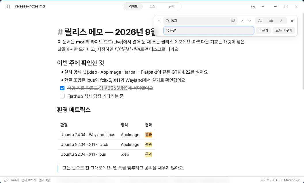
When there are no matching results, it says “No results” instead of showing the number 0. A red border appears around the input field. This lets you immediately check whether there is a typo or the term really does not exist in the document.
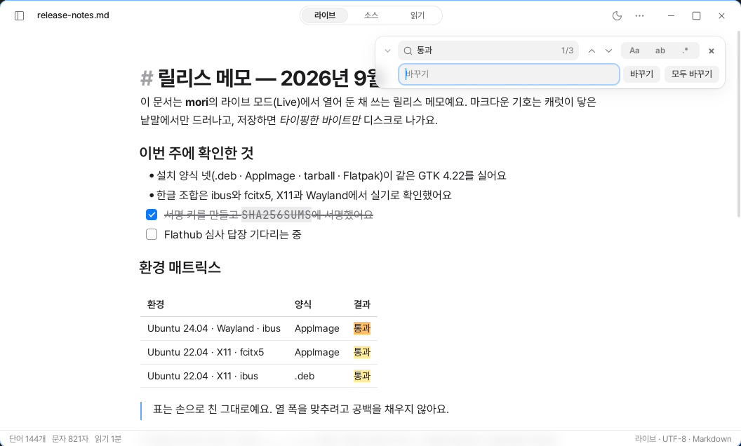
Ctrl+H. The match count for the search term 통과 is displayed as 1/3 inside the input field.We only removed one row, but more of the document became visible. The first search result was also less likely to be hidden behind the card.
Find is used far more often than Replace. If a feature that is only used occasionally is always expanded, you pay the cost every time you do something you do often.
We did not change everything to resemble other editors. We kept the card floating in the upper-right corner and the options button. We looked at other products not to imitate them, but to distinguish familiar conventions from choices unique to mori.
The Text Beneath the Card Is Actually Blurred
The Find card looks like glass. It is not merely an effect. It actually redraws the document beneath the card with a blur.
At first, we decided to omit the blur effect entirely on Linux. GTK’s renderer has no way to sample the surface behind a sibling widget. Moreover, because the background changes whenever the document is scrolled, it would have to be recalculated for every frame. We decided that a fast screen was more important than a pretty one.
The solution was to have the editor draw the blurred screen itself instead of making the card blurry.
When the editor draws the document, it draws only the part covered by the card one more time. On the second pass, it applies an 18 px blur, and the card adds only a faint tint on top.
The only parts redrawn are the lines actually visible beneath the card, and this work happens within a frame that is already being drawn anyway. The number of frames scheduled while idle remains 0.
The header works the same way. When you scroll the document, the title moves beneath the header and becomes naturally blurred. Because the sharp and blurred views are drawn at the same moment, they never fall out of alignment.
We added a 1 px border around the edge of the glass instead of a shadow. A shadow alone did not make the edge easy to distinguish against a white document. We also left a 24 px gap between the card and the right edge of the window so the shadow would remain visible.
We did not add an entrance animation. Someone who presses Ctrl+F already has something they want to find. Even a short flourish becomes a delay at that moment. The card opens the instant it is invoked and looks like glass from the very first frame.
We Also Found the Search Results We Had Been Missing
Once we reduced the interface, we noticed places where search results were not being displayed correctly.
Results inside tables were not highlighted. In reading mode, the highlight positions were misaligned. Inside inline code and highlighted text, the existing background color covered the search indicator.
Each problem had a different cause.
Inside tables, the position had to be calculated separately for each cell. In reading mode, the positions of hidden symbols had to be accounted for again. For text with a background color, the search indicator had to be drawn first.
We fixed all three problems by correcting the way positions were calculated and the order in which colors were drawn.
Search results are shown in yellow. Only the result currently being viewed is shown in orange. We use the same colors on screen and in PDF and HTML.
We did not change the text color. A highlighter does not paint over the letters; its color sits between the paper and the letters.
Glass Has a Cost
When you scroll with the Find card open, the blur effect is recalculated for every screen. Only the area beneath the card is redrawn, but that does not eliminate the cost.
That is why we do not stack multiple layers of glass. We use it only for the header, the sidebar, and the one card currently open.
Glass is not a decorative material. It is a budget that must be allocated within the limits of performance.
Making the Find window prettier and making it lighter seemed like opposing goals. But in the end, only one question remained.
When should this screen be redrawn?